I chose to present a tea promotion I worked on while at Starbucks because it showcases the breadth of my design portfolio. Since it's a seasonal promotion, it also allows me to demonstrate my thought process around sell-through challenges for managing short shelf life. At each stage, I pause to EVALUATE how the work can be refined and elevated to deliver the strongest result.
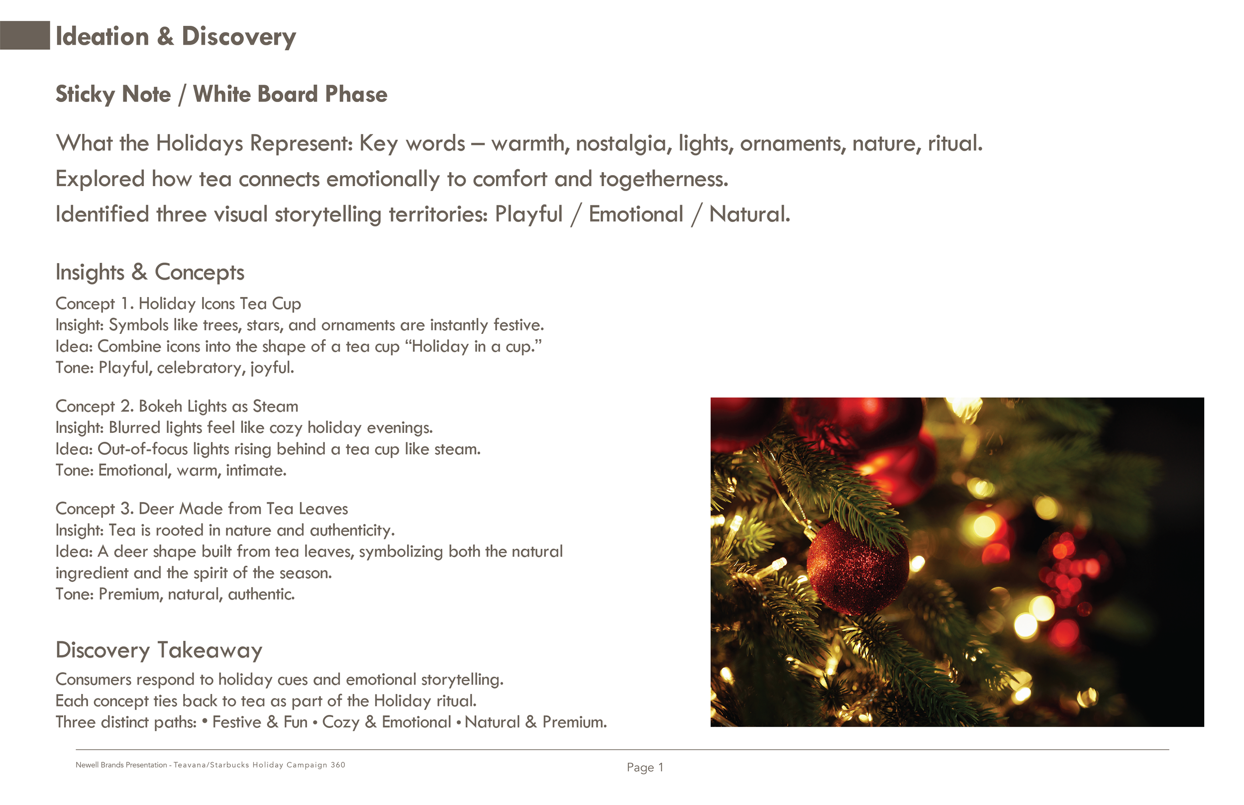
At the sticky note stage, I ask myself, what do the holidays represent? And I formulate the keywords to describe it, warmth, nostalgia, lights, ornaments, nature, and ritual. From there, I think about how tea connects emotionally. It's about comfort, togetherness, and shared holiday moments. Once I nailed down the meaning of the holidays, I look at how successful brands bring that to life, and I translate those strategies into my product. Out of that exploration, I identified three clear storytelling directions, playful, emotional, and a visual metaphor. Each became the foundation of a distinct concept. Concept one is holiday in a cup, literally. Concept two is bokeh lights as steam rising from the teacup. Concept three, a reindeer made of tea with a teacup for a nose.
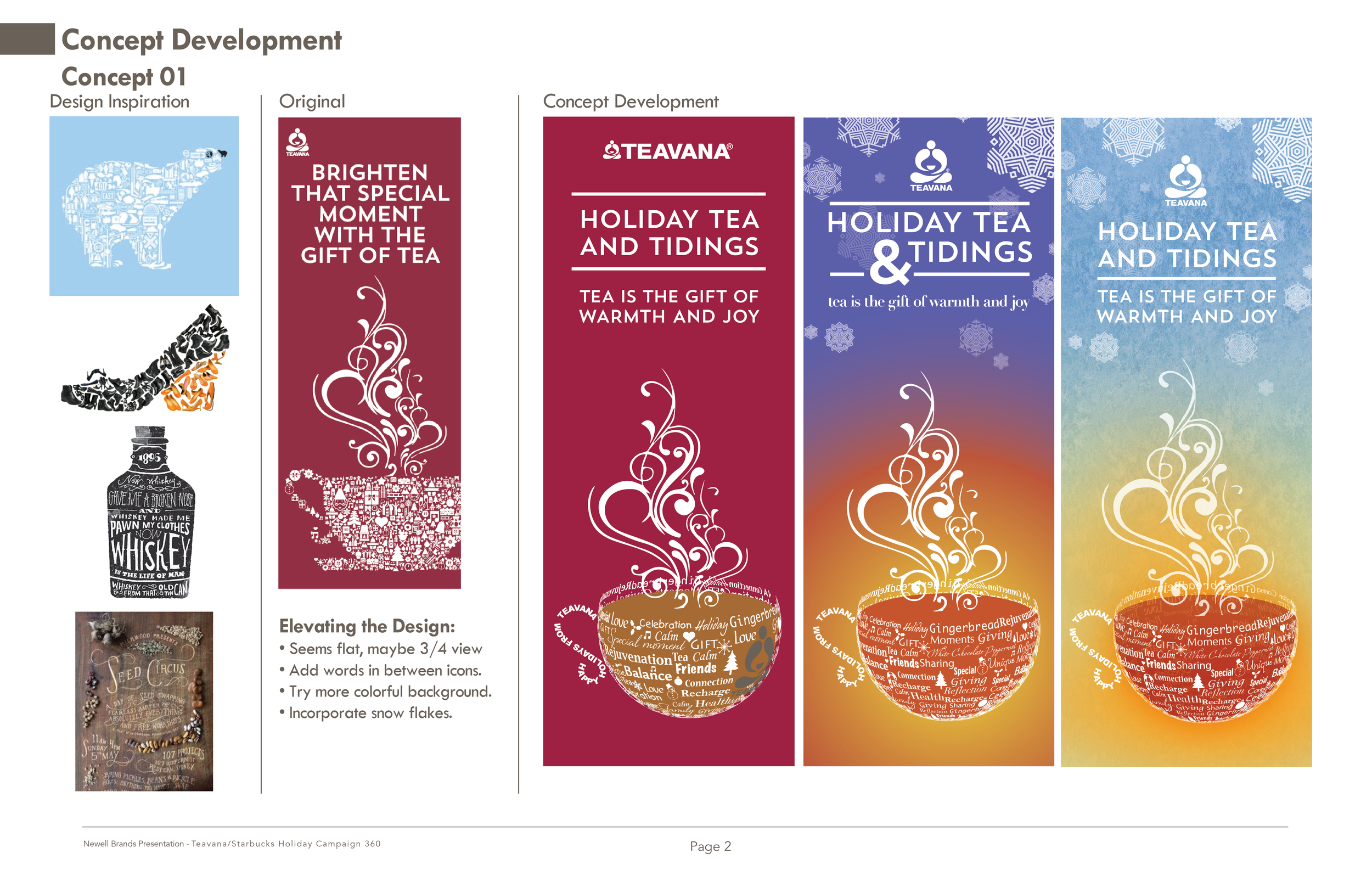
Who does the holidays well? Coca-Cola with a polar bear. The lovable image conveys warmth, family, and togetherness. My research led to a zoo concept with a polar bear made from icons. My holiday teacup uses the same principles - a recognizable image made from holiday icons. Consumers grasp the message at first glance and then enjoy the discovery of the detail, making the brand memorable, clever, and emotionally connected. Once I have the design down, I push to refine and elevate it further.

Concept 2 was a bokeh of lights as steam. Blurred holiday lights, for me, evoke the warmth of childhood by the tree imagining the magic of what was to come. I could visually connect the sense of warmth and intimacy directly to the product. The tone here is emotional, warm, and personal, a different kind of holiday energy from Concept 1. Once I had the design down, I pushed to refine and elevate it further.

For Concept 3, I drew inspiration from creative ads that cleverly formed images out of unexpected elements, like a Santa face in mayonnaise or a Santa hat in beer foam. I created a reindeer, Rudolph to be specific, made from tea with a cup for the nose. I also incorporated snow flakes into the design, which will tie in nicely with the packaging later. I felt this was the strongest idea, so I expanded the theme to support the holiday campaign better with a Christmas tree and a candy cane with Holly, both using the teacup as accents like the deer.

I went back and reviewed more inspiration to elevate my design further. I realized the inspirational images were fairly simple and direct, while mine was a little too busy. I created two more versions to refine and elevate it further.

Here is Concept 3 as it evolved.
• The original,
• Round 2a, is simplified background by toning down textures and snowflakes,
• And round 2b, a lighter background, I added the final tagline and a narrow the tree choices.
Concept 3 round 2b became the final. This version pulls everything together into a cohesive set.
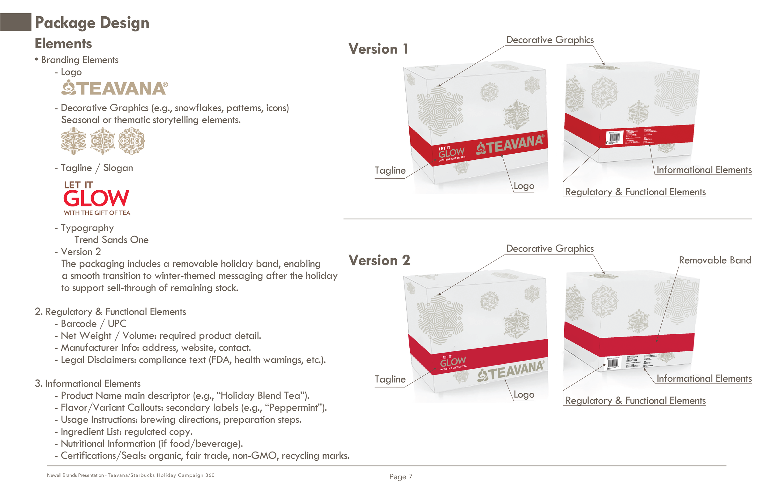
I broke the packaging down into three main categories: Branding elements, which include brand and holiday, regulatory and functional elements, and informational elements. Version 2 shows with the right placement and a removable band, we can plan for sell-through of remaining stock after the holiday. With a simple transition to winter.

As an aside, I included more challenging packaging examples to highlight my thought process and approach to solving design constraints: Honeywell wanted a clean look but required three languages. I created three fronts: English–French, English–Spanish, and a top panel with all three languages, in a smaller footprint for tighter display areas. I designed it to account for the product’s weight, knowing it would likely stay in place on shelf until purchase. For the Vanish packaging, I created the Custom die line which frames the product as hero, paired with fluffy laundry imagery for an emotional impact.
And now, back to your regularly scheduled program. The color palette of red, green, cream, and white was chosen because it's instantly recognizable as holiday.

For the campaign extension, these examples demonstrate how the design extends naturally into broader campaign applications.

With Banner ads, placement is key, like reaching someone sipping tea while scanning the news on CNN or Forbes, or showing up on the Weather Channel during a cold front when a warm cup feels especially appealing.

For social media, each platform plays a distinct role. Rather than dropping a placeholder here, I wanted to show my process in action. This video was staged with printed images as the backdrop and the base, but filmed in a way that it reads as real barrels.
Click on the slide to watch the video if you would like, as well as the process video I created in my dinning room.

This framework not only gets us to launch on time, it keeps momentum strong through the holidays and ensures we have a clear exit plan for sell-through after the season.
On-Time Launch, Strong Momentum, Clear Exit Plan
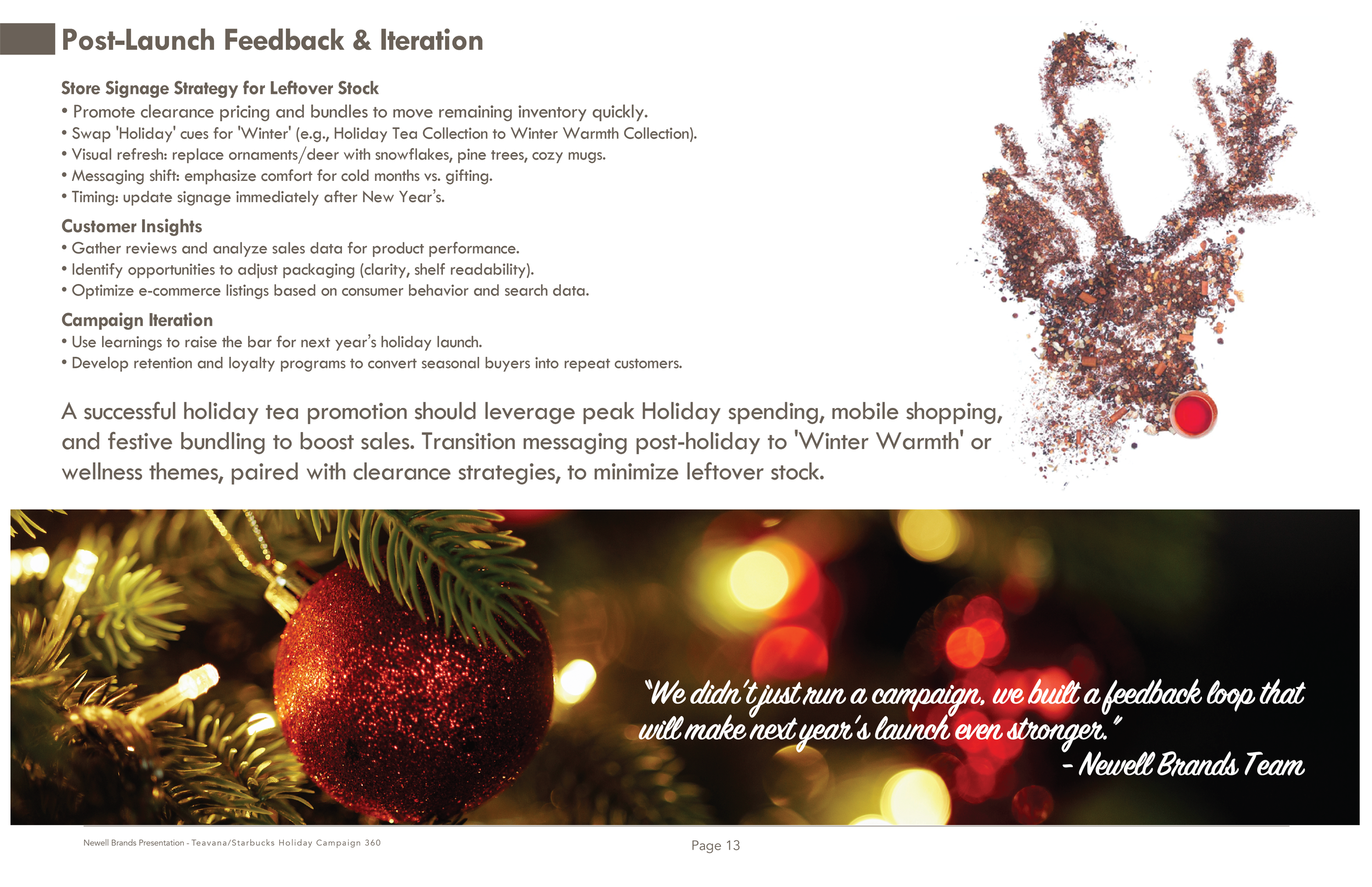
Post-Launch: Shift from holiday to winter. Clearance pricing, bundling, and refresh visuals and signage. Gather insights from reviews, sales data, and e-commerce performance. Refine packaging. Is it worth the cost of the removable band? Use learnings to strengthen future campaigns and turn seasonal buyers into loyal customers.